Redesign of the page ‘La Méthode’
(sector: EdTech)
Goal.
Redesign the user experience of the page “La Méthode”, desktop version of https://oclock.io/methode. Note: the main menu was not studied in this case study.
Why.
1) Increase conversion rate
2) Improve information architecture: for future students to more easily understand/remember the core values and the learning environment of the online school.
Context.
Startup, Sector EdTech
Turnaround.
One week
Design decisions.
Information architecture
simplify the content + as needed, present the user with an option to learn more about a discussed topic
Increase the user's attention span
breakdown and regroup the information to additionally improve the flow of the page
Maintain the personality and tone used by the school
throughout the various copywriting choices and redesign of the page
Testimonials
change the title of the testimonial section to highlight the benefits of choosing this particular school
Repeat the shape of the logo
repeat the shape of the logo throughout the page
Footer
restructure the footer to make it easier to navigate + easier to contact O'clock
Information architecture
simplify the content + as needed, present the user with an option to learn more about a discussed topic
Information architecture
simplify the content + as needed, present the user with an option to learn more about a discussed topic
Increase the user's attention span
breakdown and regroup the information to additionally improve the flow of the page
Maintain the personality and tone used by the school
throughout the various copywriting choices and redesign of the page
Testimonials
change the title of the testimonial section to highlight the benefits of choosing this particular school
Repeat the shape of the logo
repeat the shape of the logo throughout the page
Footer
restructure the footer to make it easier to navigate + easier to contact O'clock
Information architecture
simplify the content + as needed, present the user with an option to learn more about a discussed topic
Tools/method.
Figma
Topic Maps
UX Competitor Analysis
User research : users and stakeholders
User testing
Wireframing
Topic Maps
UX Competitor Analysis
User research : users and stakeholders
User testing
Wireframing
Deliverables.
PDF of the case study
Wireframes
Clickable prototype (Figma)
Wireframes
Clickable prototype (Figma)
.
Exemples de Topic Maps.
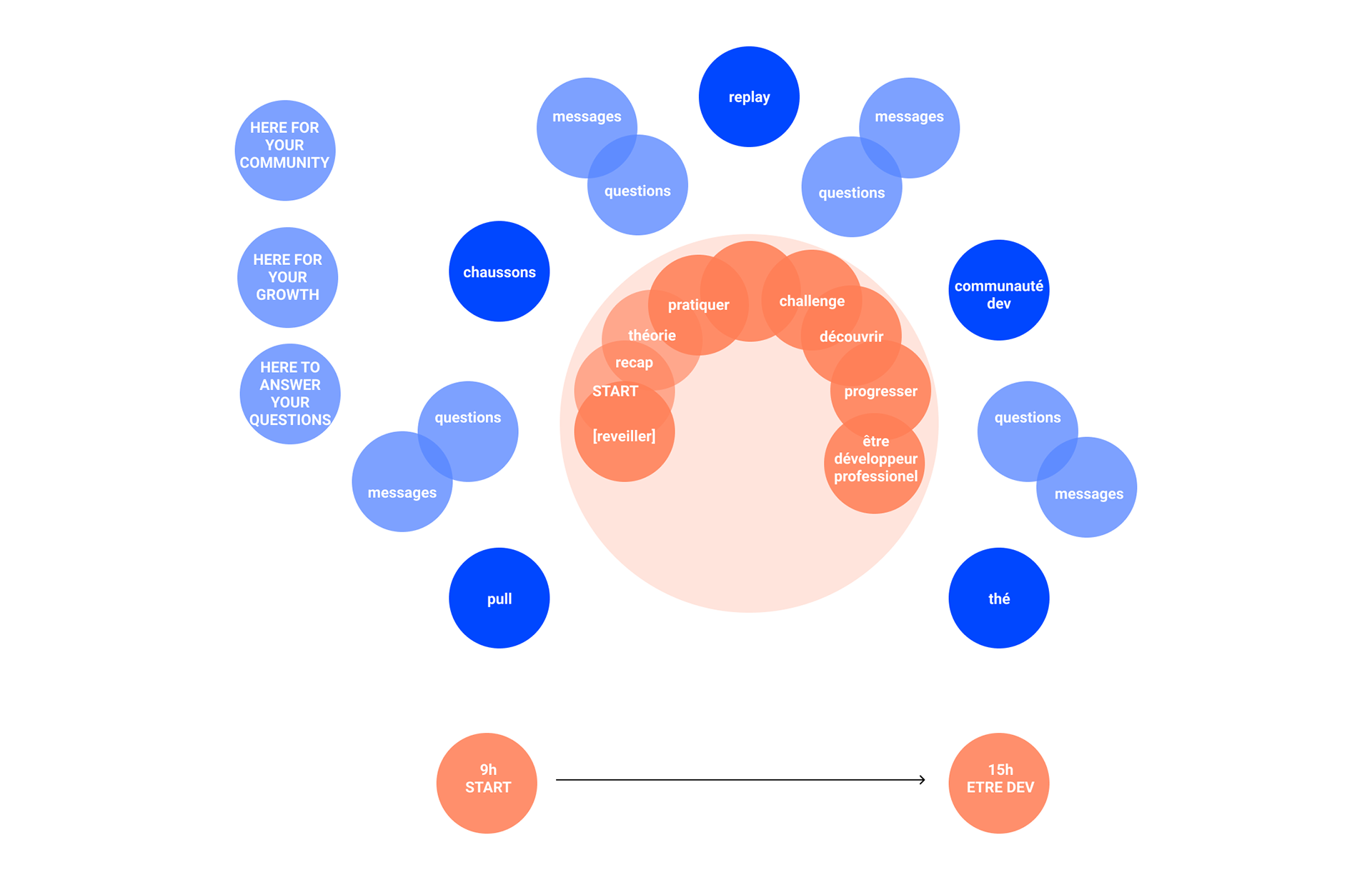
'Topic Map 1'
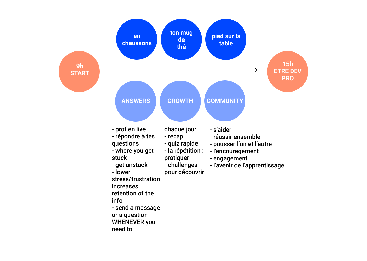
'Topic Map' condensé
*Prototype uniquement clickable sur vue desktop
